
Created a wellness score that empowers women to make progress without the pressure of perfection.
Designed a research-grounded feature that helps women track wellness and celebrate progress in a cycle-syncing app. After two rounds of user testing, goal completion rose 40%.
01 | Background
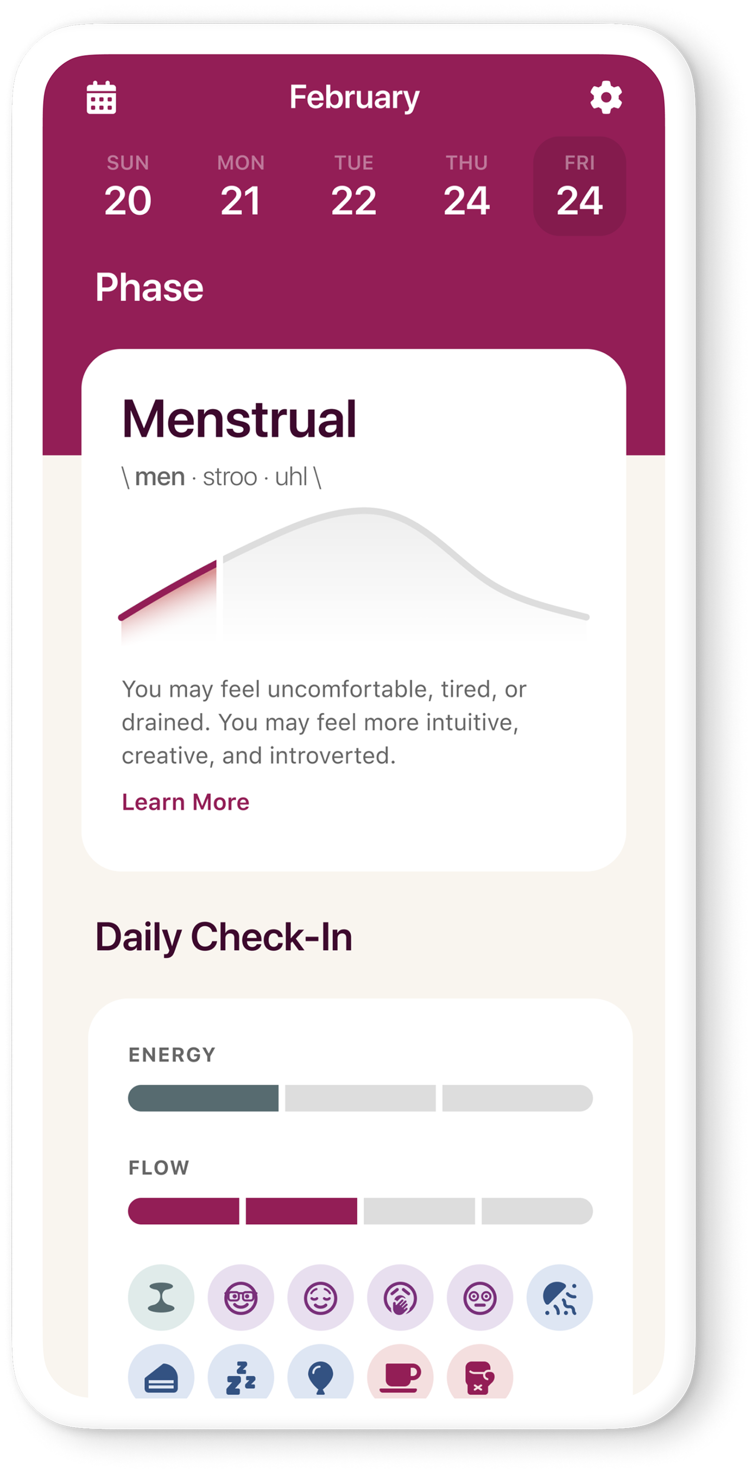
The Agenda helps women sync their daily lives to their cycle.
What began as a paper planner became a cycle-syncing app. It helps women make choices about food, exercise and self-care throughout their cycle, filling the gap between tracking periods and supporting overall well-being.
Empowering women to embrace their menstrual cycles and improve well-being, productivity and daily life through personalized cycle syncing.
02 | Problem
The wellness score wasn’t keeping women engaged over time.
The wellness score is a daily check on how you’re doing: your mind, your body, and what’s going on around you.
The goal
The client wanted people to come back and log every day, not just try it once.
A score that could backfire
The original plan scored you out of 100. Seeing a low number on a bad day could make you quit.
Skipping would hurt your score
If you didn’t log something, like mind or body, your score dropped anyway.
03 | Research
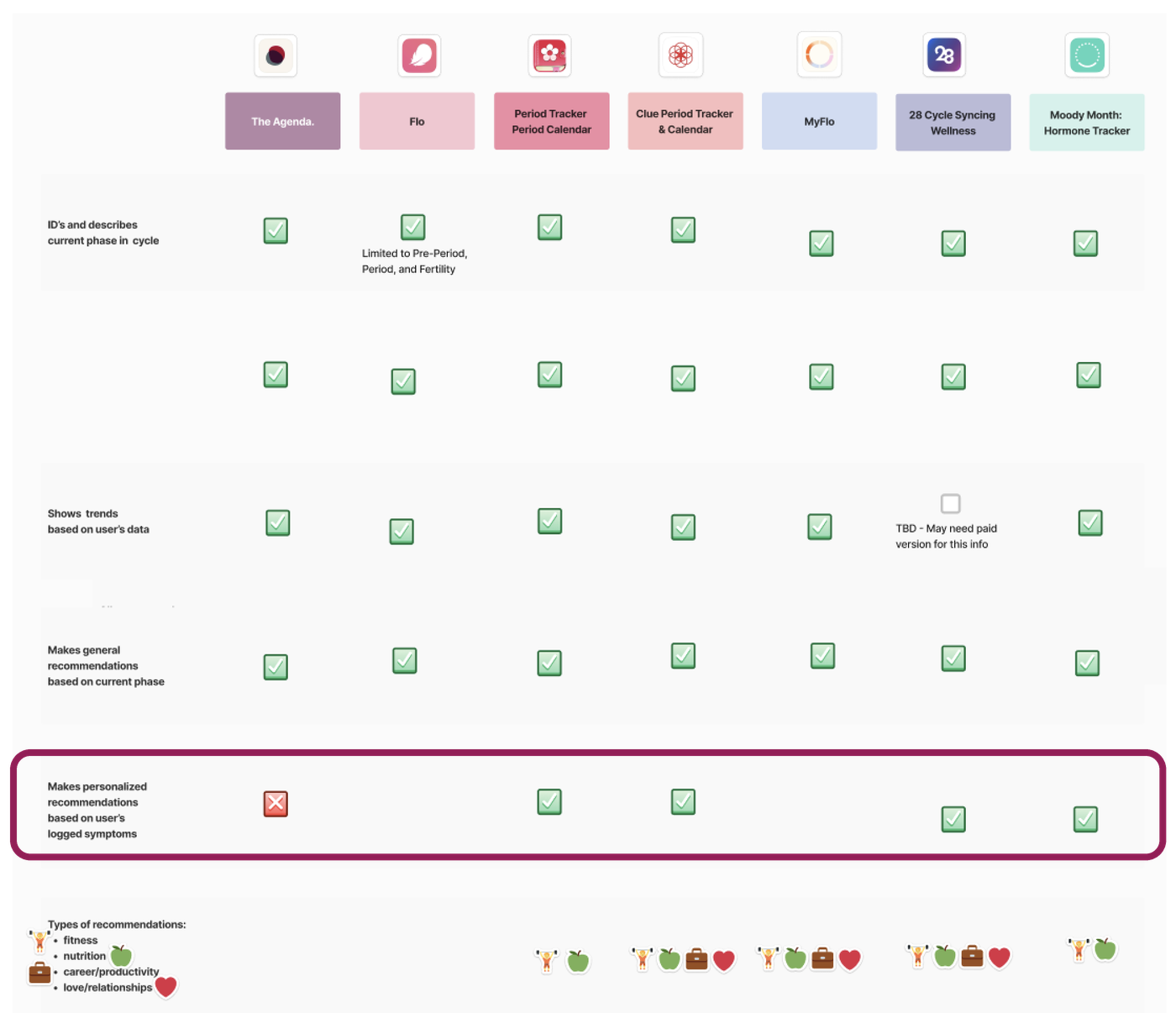
Other apps tailored their advice to what users logged. The Agenda didn’t.
There was no user research yet, so the team started there in three steps, and I contributed to each one.
The Agenda gave everyone the same advice. Apps like Clue and Moody Month based theirs on what each person logged.
Mostly ages 25–34. Asked what keeps people tracking, and what they want to get out of it.
Ages 31–36. Learned how they track today, and what’s missing.
From research to the question
Women wanted help with their mood. We worried a score out of 100 would feel like a grade.
People wanted to learn something from their data, not just see dates.
People wanted the app to feel personal. Other apps used what people logged. The Agenda didn’t.
How might we help women
- 1. check in on how they feel without feeling judged
- 2. see patterns in their wellness over time
- 3. stay on track with their personal goals
while keeping them coming back every day?
The last part was the client’s goal.
Personas
Two very different trackers. The score had to work for both. I built two personas from the survey and interviews, so the team designed for real people instead of our own assumptions.

Betty, 25
“Tracking my symptoms and cycle helps me understand my health, plan better, and stay focused on my studies.”
A quick check-in that takes seconds and never feels like a grade.

Laura, 34
“I want a way to easily and seamlessly optimize my health.”
Room for detail: trends over time and goals she sets herself.
04 | Scoping & design process
From research to 3 MVP features, quick or detailed.
The client asked for the wellness score and achievements. I scoped them into three features, each answering one part of the guiding question.
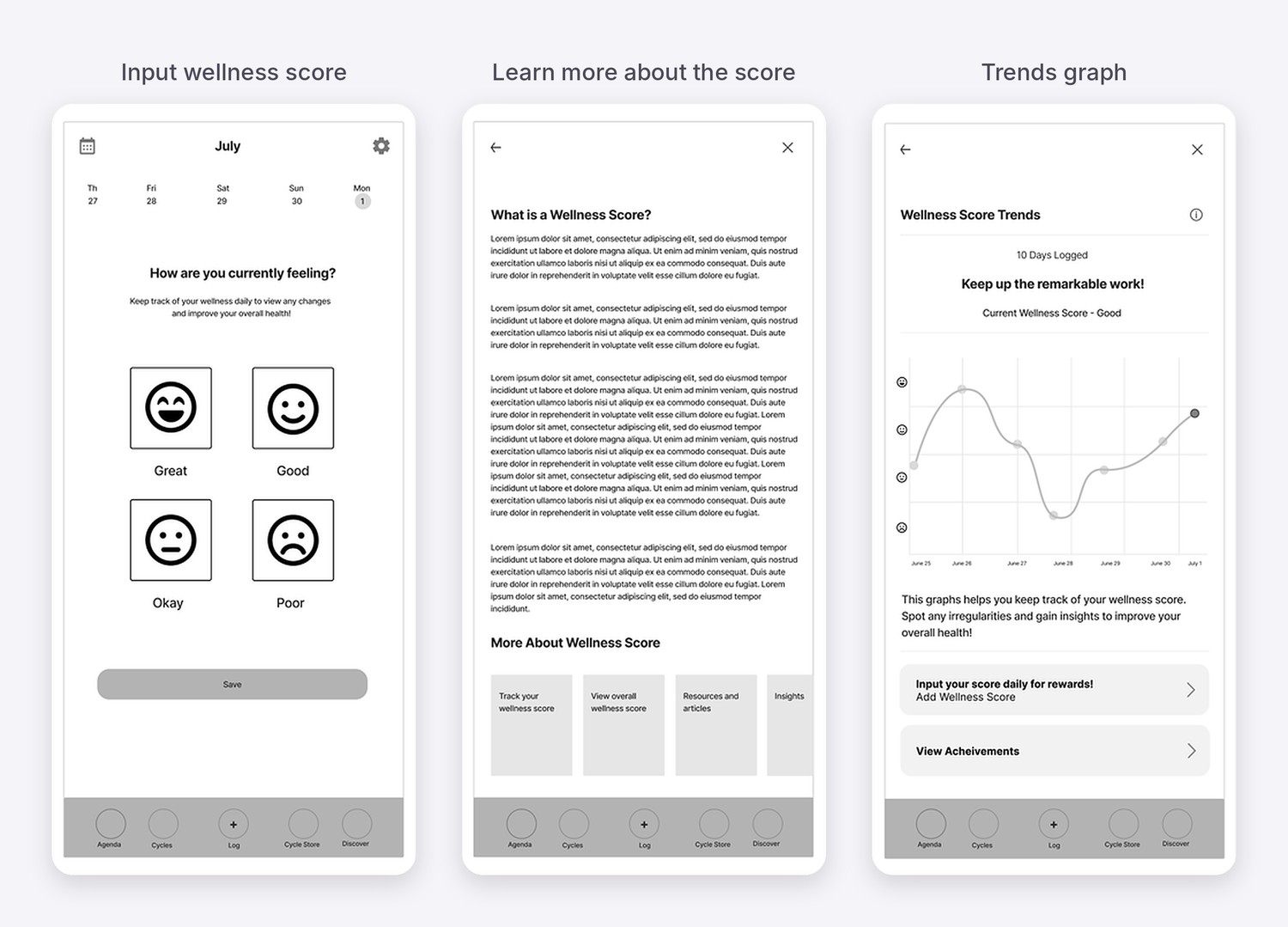
Daily mood check-in
Great, good, okay or poor, instead of a number.
Wellness trends
Your check-ins over time, so patterns are easy to spot.
Personal goals & rewards
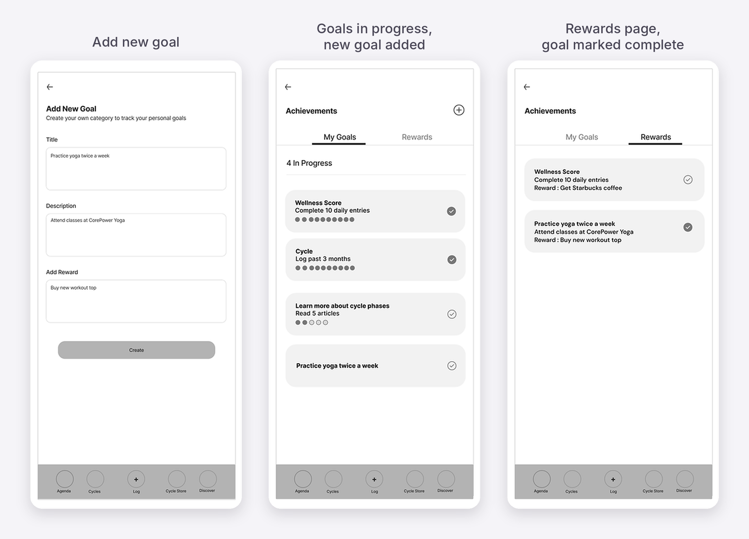
Set your own goals, track progress, and unlock rewards you choose.
Quick for Betty: a one-tap check-in. Detailed for Laura: trends and goals when she wants more.
From flows to sketches to a testable MVP
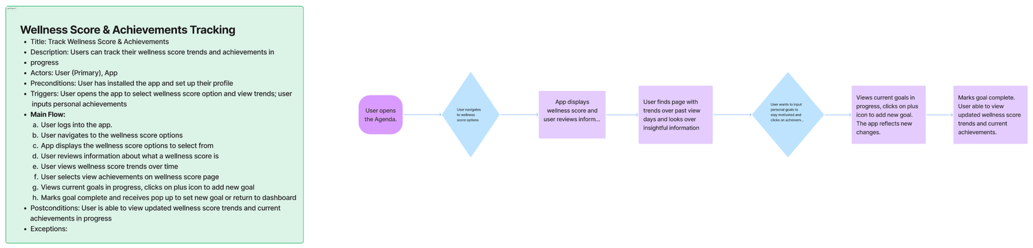
Use case
Mapped every interaction to plan the screens.
Journey flow
The steps a user takes to log and reach a goal.
Sketches
Quick ideas on paper, based on the research themes.
MVP wireframes
Mid-fidelity screens, ready for usability testing.
05 | Decisions & tradeoffs
Trading precise scores and extra info for encouragement and clarity.
Mood check-in vs. a score out of 100
Mood check-in
Log the day as great, good, okay or poor. No numbers.
Score out of 100
The client’s scoring model. Precise, but easy to read as a grade.
Seeing a low score on a bad day could make someone give up. And skipping a section would drop the score, even if they felt fine.
We gave up precise data for a score people would actually keep using.
Trends front and center vs. more health insights
Trends first
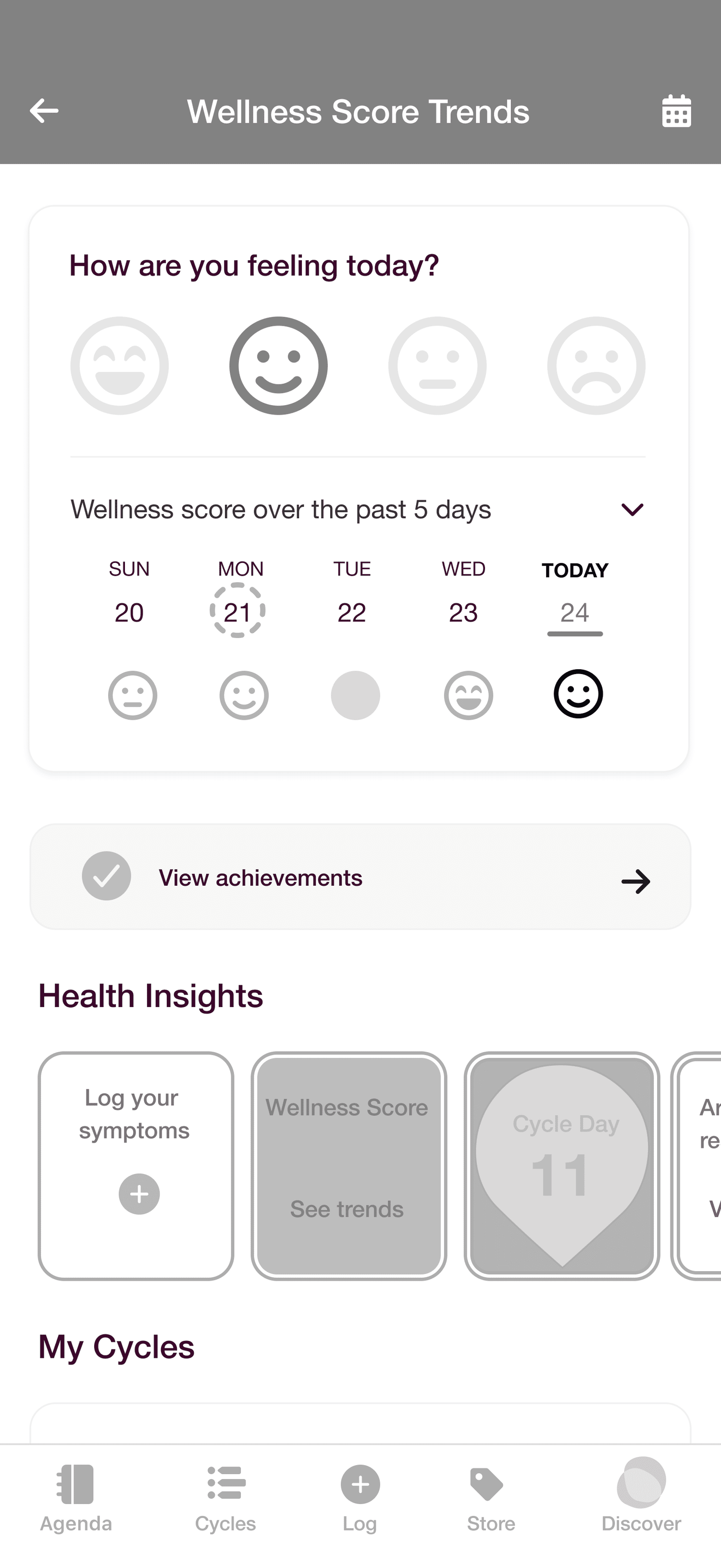
Wellness trends on their own page, easy to reach.
Trends + health insights
Trends in a dropdown, next to added health insights.
Trends were buried. Most participants couldn’t find them, and most found the extra health information confusing.
Less health information on the page, but trends are easy to find.
06 | Key improvements
Making check-ins more personal and things easier to find.
Usability testing with 8 participants led to three key improvements.
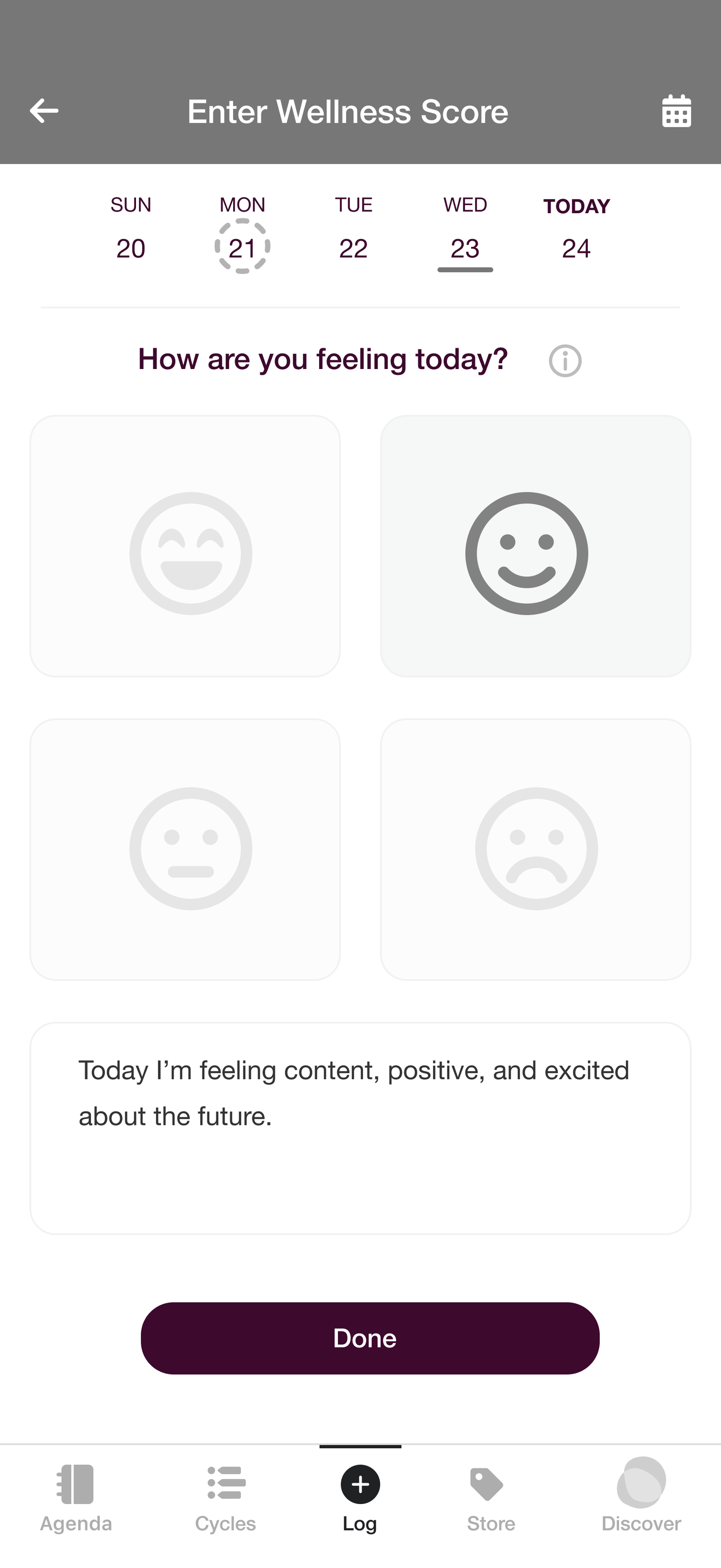
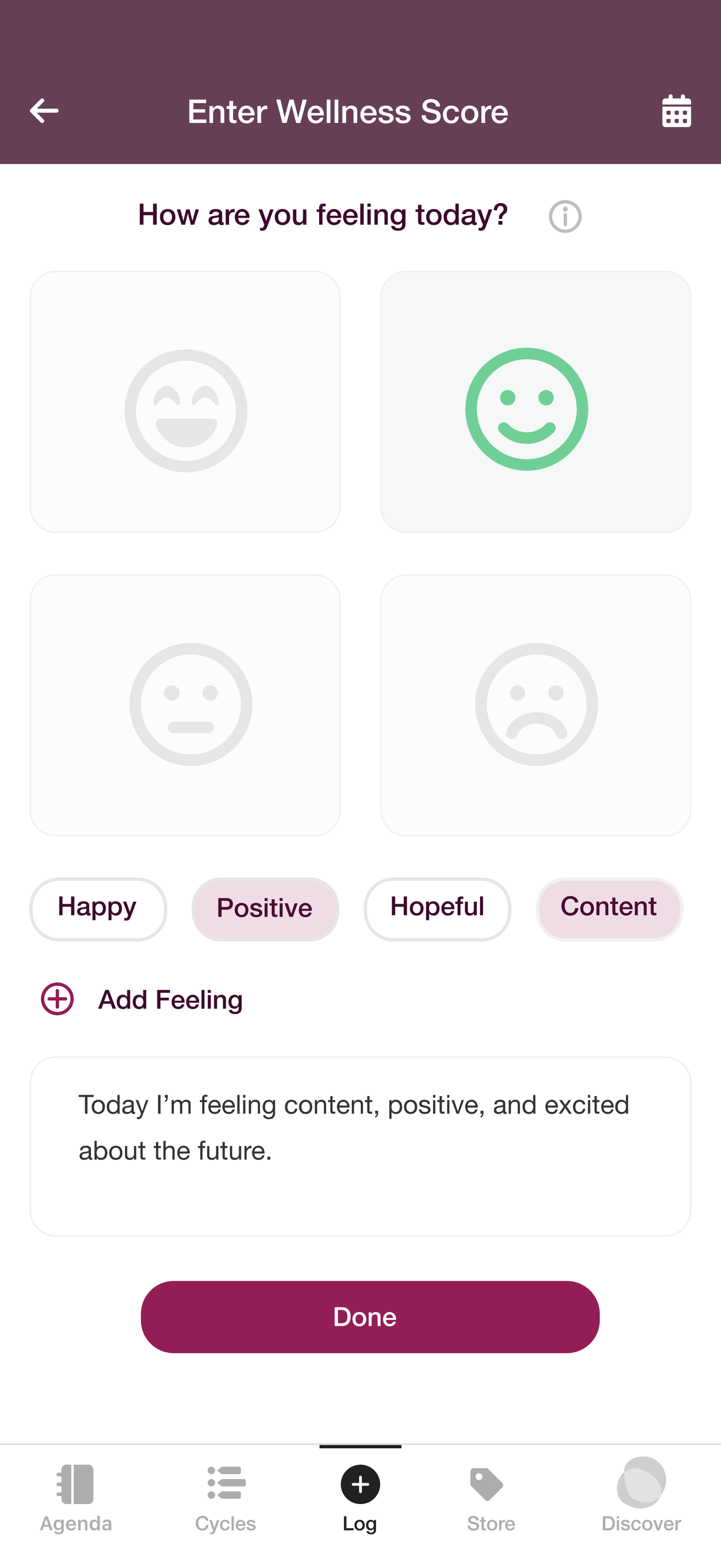
01 — Describing feelings, not just moods
A few participants wanted more ways to describe how they felt, beyond picking a single mood.
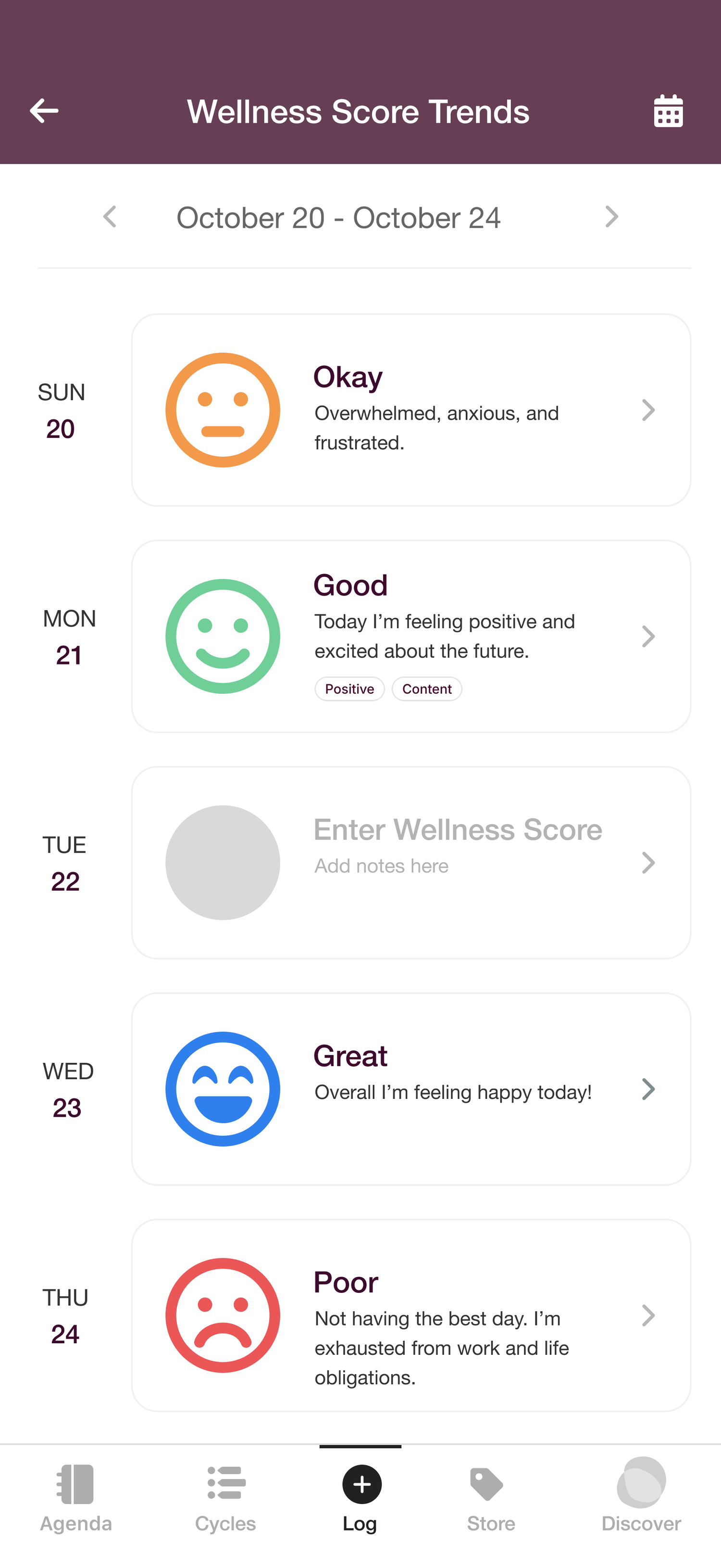
02 — Making wellness trends easy to find
Most participants couldn’t find their trends, and many found the extra health information confusing.
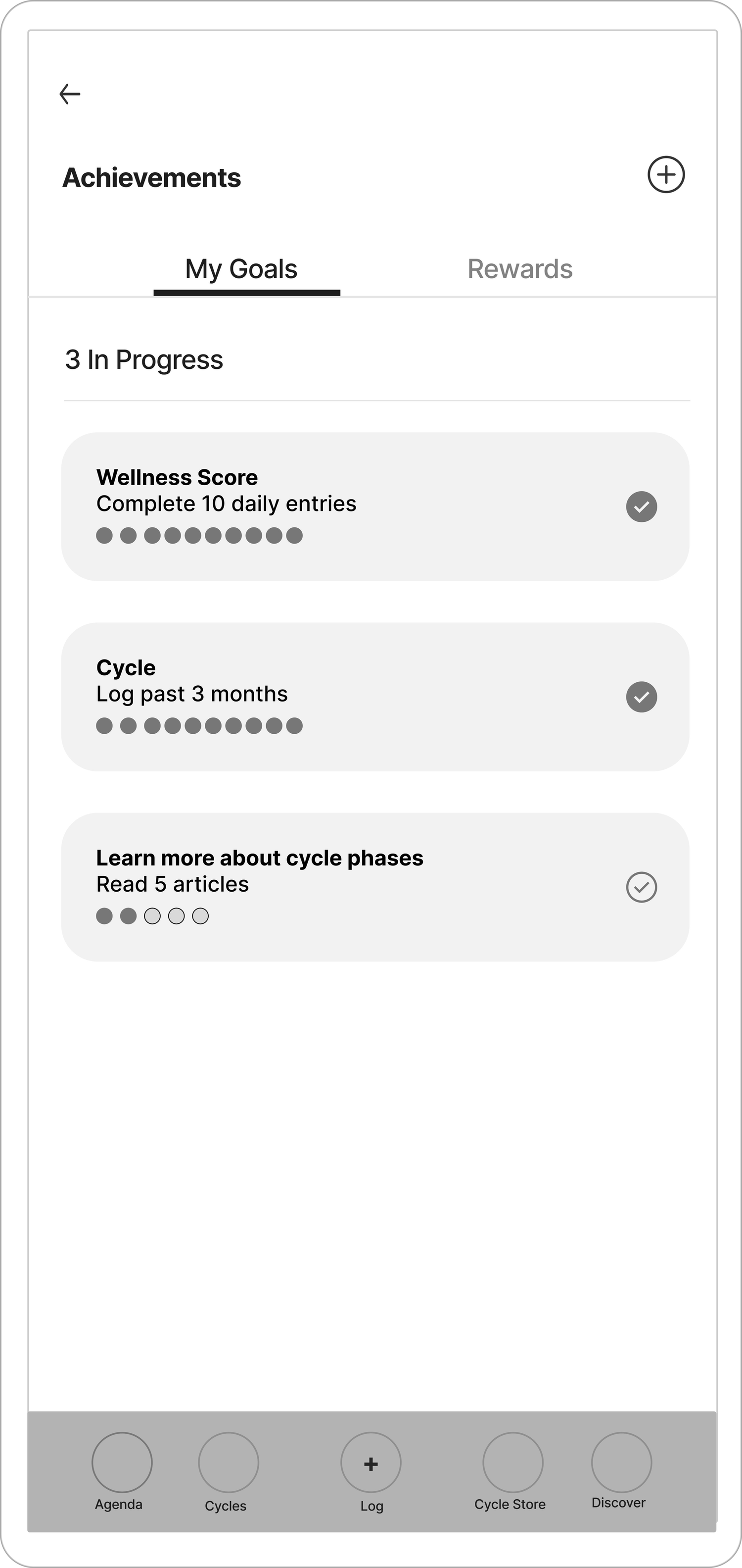
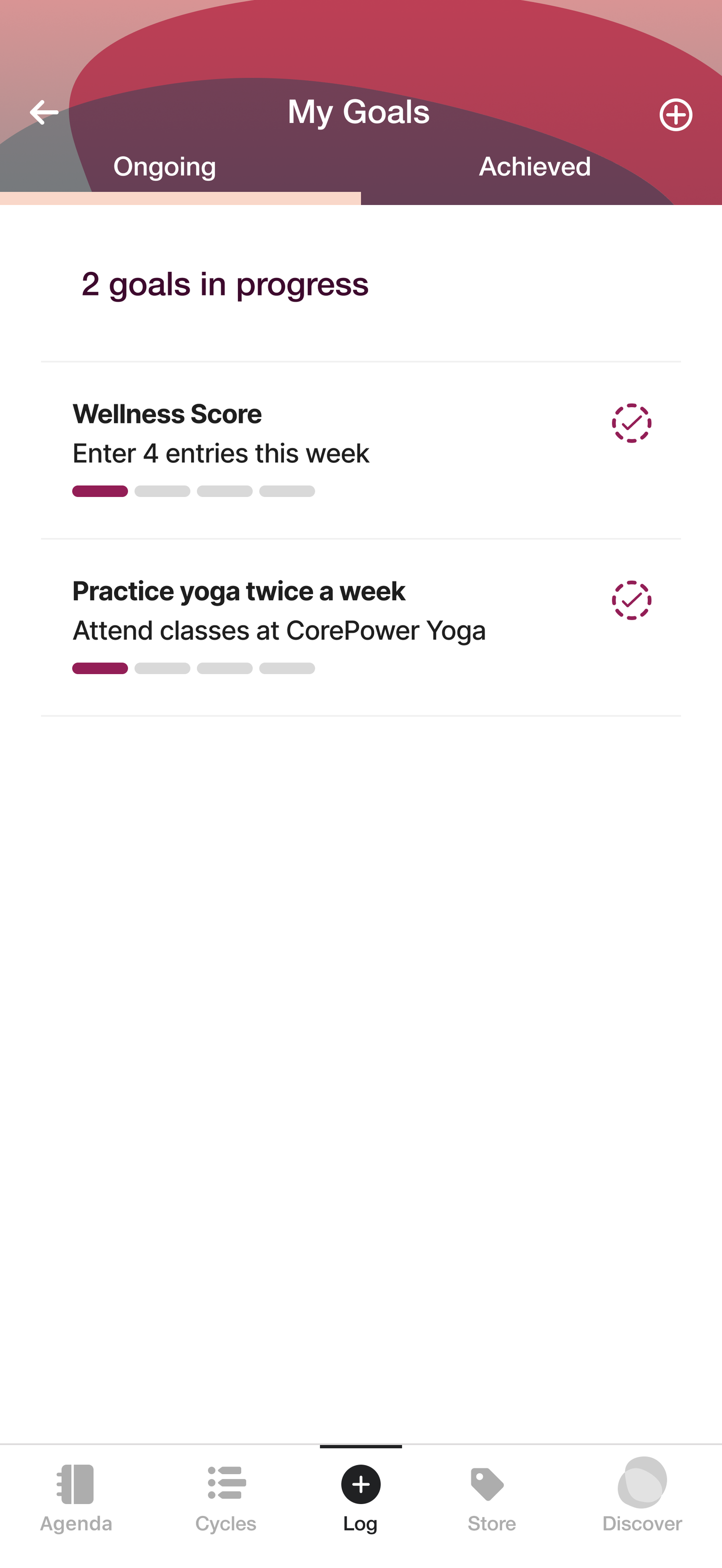
03 — Clearer goal tabs
Most participants said the tab names didn’t make it clear which goals were in progress and which were done.
07 | Final solution
A daily check-in, personal goals, and trends.
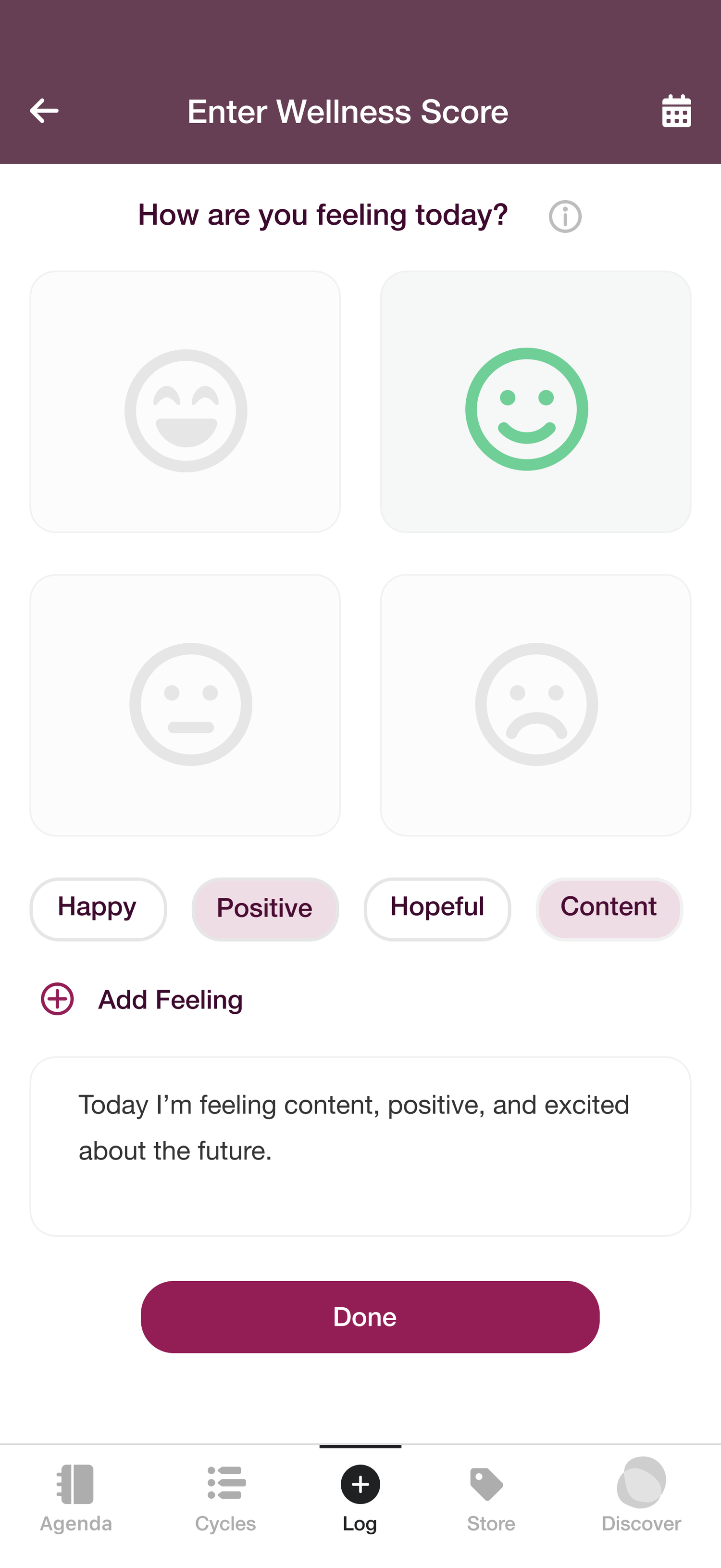
Daily check-in
Pick a mood face, then add feelings and a note.
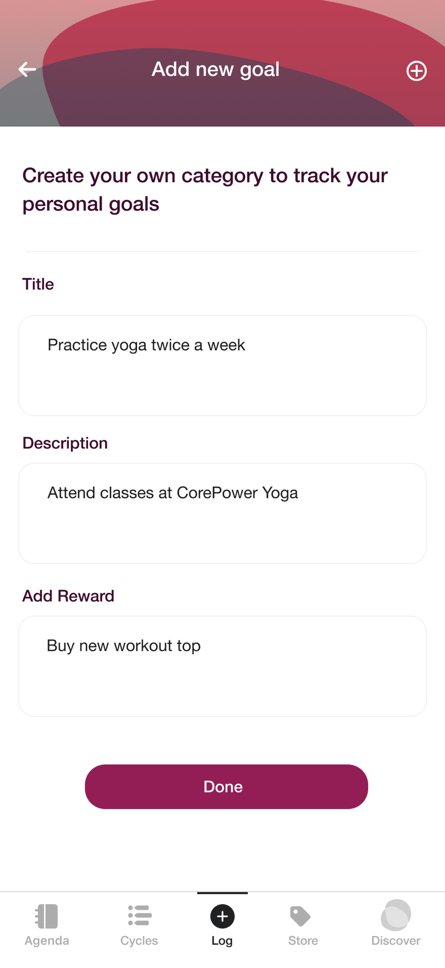
Goals & rewards
Set a goal and a reward for reaching it.
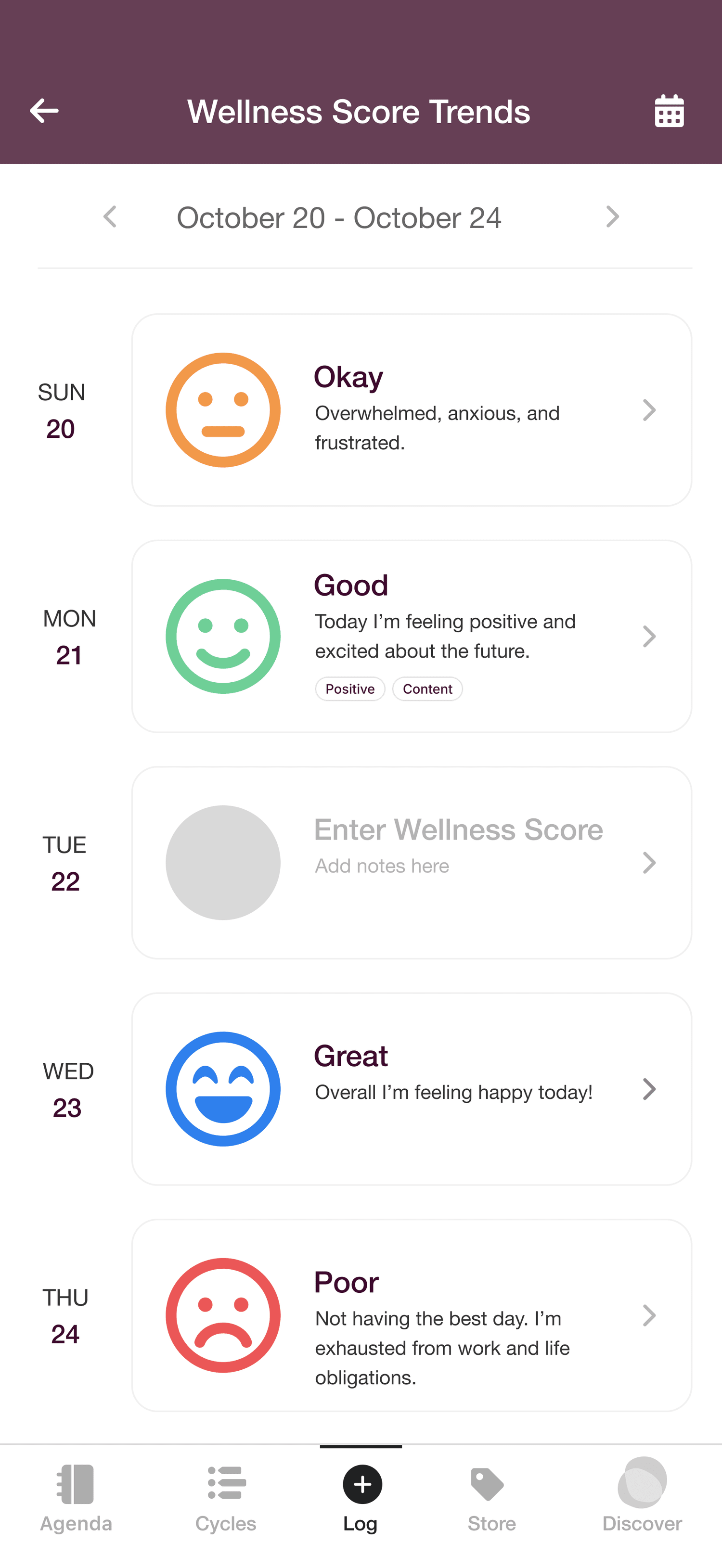
Wellness trends
See each day’s mood and feelings in one list.
Log how you feel in a few taps
- Pick a mood face instead of a score out of 100
- Add feeling tags and an optional note
- See each day’s mood and tags on the trends page
Set personal goals and celebrate wins
- Create a goal with a description and a reward to look forward to
- Check it off when it’s done and see it move to Achieved
08 | Results & impact
What I delivered in 8 months.
key design improvements from usability testing
increase in goal completion between test rounds
designed the wellness score and features from scratch
user research The Agenda had ever done
rounds of usability testing with 8 participants
screens designed end to end
Participants found the check-in motivating, not like being graded.
09 | Reflection
Looking back.
Where it landed
- The client felt the MVP was a strong fit for their goals and mission.
- The research and personas stayed with the team as a foundation to build on.
- The startup later changed design direction, so this version didn’t ship.
What I’d do differently
- Give testers more guidance and ask follow-up questions.
- Set clear success measures before testing.
- Design for edge cases, like new users with no data yet.
10 | Learnings
What I’m taking with me.
Show, don’t argue
Showing how a low score would feel on a bad day changed the client’s mind faster than any argument.
Remove before you add
People found their trends once I took extra content away. Now I look for what to cut first.
Make research last
With no research to build on, I contributed to generative research (an app comparison, a survey and interviews) and evaluative research (two rounds of usability testing), creating a foundation the team could keep using.
Tone matters
In a wellness app, words and visuals shape how people feel. Testers found the check-in motivating, not like being graded.